Heat maps provide valuable insights about your website, opening up opportunities to analyse how real users are engaging with your pages and content. With the ability to pinpoint elements that are performing well – as well as those that are underperforming – you can use website heat maps to fuel your conversion rate optimisation (CRO) strategy. They provide the evidence you need to make data-driven improvements to the usability of your site, and often inspire experiments such as A/B tests designed to upgrade its user experience (UX).
The potential revenue impact of heat map analysis should not be underestimated. It galvanises your teams to test incremental refinements, all with the core objective of making it easier for users to navigate and interact with your brand’s site. You can quantify the effect of individual UX changes on engagement metrics like task success and click-through rates (CTRs), then show how this naturally breeds more on-site conversions over time.
Ultimately, by promoting this type of phased experimentation mindset, heat mapping helps you make more of your existing traffic and grow your bottom line. The beauty of conducting carefully designed tests on each website change your business makes is that you can guarantee you’re always taking one step forward, never rolling out a deployment that could take you two steps back.
Here, we’ve provided a comprehensive overview of heat maps, including how they work, the different types, and how to use heat mapping for CRO – all of which will be valuable if you’re relatively new to the topic. You’ll also find practical tips from Impression’s in-house experts, offering deeper insights for those looking to take their heat mapping analysis to the next level.
If you’re looking for something specific, you can use the table of contents below to jump straight to it.
- What is a heat map?
- Introducing website heat maps
- How do website heat maps work?
- The benefits of website heat maps
- Creating impactful, digestible visualisations
- Optimising CTAs, buttons and interactive elements
- Removing distractions from user journeys
- Helping users reach conversion points
- Understanding cognitive load
- Increasing user focus
- Analysing value proposition effectiveness
- Optimising creative
- What are the different types of heat maps?
- Move heat maps
- Scroll heat maps
- Click heat maps
- Engagement heat maps
- Rage click heat maps
- AI-generated attention heat maps
- Who uses website heat maps?
- Heat map examples and use cases
- Combining A/B tests with heat maps
- Integrating heat mapping tools with Google Analytics
- Inspiring hypotheses for user testing
- Fixing errors in user journeys
- How to get heat maps for your website
- Free heat mapping tools
- More advanced platforms for heat mapping
- Using heat map analysis to improve user experience
- Heat map analysis and CRO by Impression
Once you’re ready to get started with heat mapping, head over to our CRO agency page for a flavour of what we can do for your business, or get in touch for a free consultation.
What is a heat map?
A heat map is a graphical method of representing data that uses colour to convey complex information in a way that can be quickly and easily understood. The different colours correspond to different values, most commonly the number of instances of certain metrics.
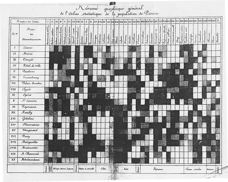
Heat mapping is a form of data modelling that is thought to have originated all the way back in the 1800s. Toussaint Loua, a highly regarded French statistician, provided the first known example in the form of a chart he produced in 1873. Loua’s early heat map documented population statistics for the city of Paris. He used manual greyscale shading to depict higher values in dark grey and black, with lower values in light grey and white.
The next leap forward came in 1914 with the publication of Willard C. Brinton’s Graphic Methods for Presenting Facts, an impressive survey of statistical diagrams in use at the time. Although Brinton referred to heat maps more generally as ‘map presentations’, he remarked that these types of visualisations were of ‘prime importance’ and placed them front and centre in his study.
It’s clear, then, that heat mapping as a method of recording and visualising data has been around for a long time. However, the term itself was only coined in 1993 by software designer Cormac Kinney, a serial fintech founder who has launched four successful start-ups over his lifetime. Kinney created a tool that used computer-generated heat mapping graphics to display financial market information in real time. He trademarked the phrase ‘heat map’ but didn’t renew it, opening the term up to common usage.
Heat maps have since been adopted in a variety of industries over the years, including finance, travel, sports and various research fields. As the internet has continued to dominate much of our work and social activities, they’ve become a valuable tool for analysing and optimising website performance.
Introducing website heat maps
Website heat maps provide data-backed insights that business owners and marketers can use to monitor and improve user engagement with sites. By illustrating how users scroll, click and navigate around the site, they provide an intuitive insight into how real people interact with each webpage. There are a variety of different types of heat maps that you can explore when analysing your website, which we’ll explore in more detail later in this guide.
While the user-friendly visualisation of heat maps makes them easy to understand compared to numerical data, it’s important to analyse the information carefully and investigate further before actioning any changes on your site. Many heat mapping tools also offer the ability to play back screen recordings of users interacting with pages, which is a logical next step that can provide further insight. From there, you can work on the design of your pages and test the impact before rolling out adjustments.
How do website heat maps work?
Website heat maps are able to illustrate a wide range of data, such as the location and frequency of clicks, how far down the page users scroll, and which areas of a webpage are the most engaging. Recently AI algorithms have been trained using eye tracking and EEG brain wave data to predict where fixations are likely to occur. Fixations are often used in Eye tracking studies as a marker of visual attention. Heat maps aggregate this data and use a spectrum of colours from ‘hot’ to ‘cold’ to identify the most and least popular elements of a webpage, respectively. For example, elements that receive a lot of clicks will be red, those with just a few clicks will be blue, and those that don’t receive any clicks won’t be coloured at all. This graphical representation is overlaid on top of the webpage, creating an easy-to-understand visual map of the data.
You can filter individual heat maps to display a single user journey, all visits or specific segments. While it can be useful to view single user journeys for certain applications, analysing multiple visits together creates more accurate insights into how the average user interacts with the webpage.
Heat mapping can be beneficial for businesses in any industry, but it’s important that you have sufficient traffic to get the most out of your heat map data. The larger the sample size, the more accurate the insights.
Isabel Nunez-Lopez, senior digital experience specialist at Impression
Website heat maps are particularly effective when used as part of a wider conversion rate optimisation (CRO) strategy, taking the guesswork out of A/B testing by highlighting exactly what users are doing, when, and where. Consider the optimisation of a landing page where the goal is to get users to fill out an enquiry form. A scroll heat map can help to determine how much of the page users view, allowing the form to be positioned where it will be seen by the most people. If not enough users are converting, click heat maps can show what they’re interacting with instead of the form.

The benefits of website heat maps
From optimising the placement of the call to action (CTA) buttons on a page to identifying elements that users are having difficulty with, there are lots of great benefits of using website heat maps as part of your website design and CRO tactics.
Creating impactful, digestible visualisations
Website heat maps offer a visual clarity that simplifies the communication of user behaviour trends in a more accessible way than using raw figures. Their intuitive hot-to-cold colour gradient allows teams to quickly pinpoint which parts of a website are performing well and which need improvement. For instance, a bright red hotspot highlights areas of high engagement, whilst cooler blue areas indicate low interaction.
This makes heat maps ideal for sharing with clients, stakeholders, and members of different departments without the need for in-depth or analytical knowledge. By simplifying data interpretation into a visual overlay with a straightforward colour code, heat maps support informed decision-making and prioritisation, enabling a more collaborative approach to website optimisation across various levels of the organisation.
Optimising CTAs, buttons and interactive elements
Call-to-action (CTA) buttons are a key element of website design and should draw the user’s attention. Heat mapping can help designers optimise the placement, size, colour and design of CTA buttons, making users more likely to click. Another way to address low clicks and engagement on CTA buttons could be to change the copy on the button, capitalising on the psychology of persuasion by using more enticing language.
Heat map modelling clicks can also be used to optimise other interactive elements, such as videos and forms, by providing insights into user engagement and interaction patterns. For videos, they show where users click to play, pause or seek, allowing adjustments to video placement, controls and content based on user interactions. For forms, heat maps highlight which fields are frequently clicked and where users drop off, helping to identify and fix issues that cause confusion or incomplete submissions.

Removing distractions from user journeys
Heat maps can play a crucial role in identifying and removing distractions from user journeys by highlighting elements that divert attention away from key actions. For example, if users frequently click on non-clickable elements or interact with areas that don’t lead to meaningful interactions, it suggests that these elements are confusing or misleading. By analysing click patterns, designers can pinpoint which distractions are causing frustration and change or remove them to streamline the user experience.
Reducing the prominence of non-essential elements or optimising the layout can enhance the effectiveness of the page and ensure that users stay engaged with the primary goals of the site, such as completing a purchase or filling out a form. This targeted approach helps to create a more intuitive and efficient user journey, leading to better overall performance and user satisfaction.
Helping users reach conversion points
Heat maps can help website designers guide users towards conversion points by highlighting low engagement in critical elements. For example, if heat map data reveals that users aren’t clicking on conversion-related links and buttons, these elements might not be particularly visible or compelling. Heat map analysis gives UX teams the information needed to reposition, redesign or enhance these elements to make them more noticeable and enticing.
Heat maps can also show user paths and interactions that lead up to conversion points, helping designers understand how users navigate through a site. For instance, if users frequently abandon the checkout process, heat maps can reveal at which stage they drop off. By ensuring that every page effectively supports the user journey toward conversion, whether by facilitating a direct action or guiding users to the next step, heat maps help to optimise the overall user experience and increase conversion rates.
Understanding cognitive load
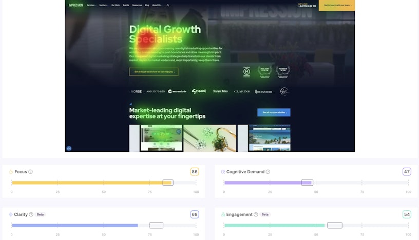
Cognitive load can be defined as how hard your brain has to work to carry out a cognitive function. AI-based heatmaps can process the amount of visual information present on a page. They can be used to benchmark how much “processing power” is required to code the amount of visual information on the page.
Busy pages place greater demands on our processing power, meaning that they take more mental effort to understand. Users can become tired and effectively worn out by tasks that are too cognitively demanding.
Yussuf Aamer, digital experience specialist at Impression
As part of our digital experience offering, we can experiment with varying cognitive load: we typically run A/B tests with different amounts of visual information to understand the optimum amount of cognitive load to encourage conversion.

Increasing user focus
Gaze paths have been used in eye tracking studies to understand the order in which users are likely to fixate and then pay attention to content. Pages with lots of high contrasting pieces of visual information can be described as having a low focus score. When users are overwhelmed by pages with lots of visual information and choices effectively fighting for the users attention it’s possible that this can decrease the user’s ability to focus on and therefore retain information. In some cases it causes distraction which may prevent users from taking an action. AI heatmaps can help us to understand which elements are competing for users’ attention on a page, and then optimise it to keep users focusing on key information and interactive elements.
Analysing value proposition effectiveness
Many landing pages contain value propositions that are designed to quickly and easily communicate the website’s purpose and to convince the users that the website can meet their needs. Value propositions are hugely important to conversion rate optimisation as these help to motivate users. They’re often made up of a couple of sentences of copy describing the service and a hero image designed to compel the user into action.
Conversion rate optimisation specialists will often spend large amounts of time refining different value propositions on pages – given that these are above the fold, and lots of traffic on the internet is increasingly on mobile, space is at a premium. Increasingly, AI-based heatmaps can understand where attention will fall on these graphical interfaces and how easy or hard they are to process.
Optimising creative
By experimenting with creative executions and reviewing heatmaps, it’s possible to optimise the creative to improve business outcomes. Usually, this involves understanding how much attention is focused on the brand and the visual complexity of the digital advert.
Head over to our creative marketing services page to discover what we can do in this area.

What are the different types of heat maps?
There are a variety of different types of heat maps that are used for analysing and optimising websites. Hotjar, one of the leading heat mapping tools, offers several different types, which we’ll explore in more detail below:
Move heat maps
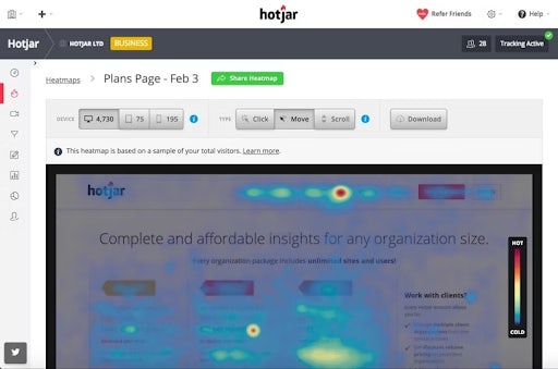
Also known as mouse or hover heat maps, this type of heat map shows the movement of the user’s mouse across the screen. This helps to show how individuals navigate each page by highlighting the areas that are most commonly hovered over.
Move heat maps can also help to highlight user engagement with the copy on the website, as some people follow along with the cursor as they read. This often results in an F-shaped pattern, where users read the main heading, then skim through the content until they find something else of interest.
Scroll heat maps
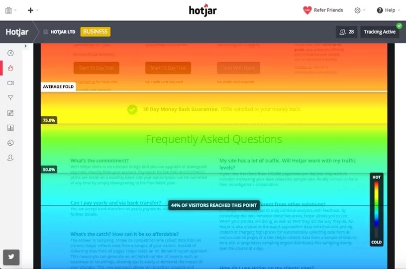
As the name suggests, scroll heat maps display how far down the screen users scroll. Most modern webpages are designed as a long page that requires users to scroll down to view more content. The top of the page will be red, and will transition down through the spectrum of colours, with no colour for any portions of the page that aren’t being viewed at all. This allows you to see what percentage of people who visit the page view each individual part.
Heat map tools also highlight which area is above the fold. This is the initial section that is visible when a user lands on the page before they have to scroll down. It gets its name from the newspaper industry, where ‘above the fold’ refers to the upper half of the front page that is visible when a paper is folded. This is where the most important news is placed to catch readers’ attention, and is also where you should position your most important content to boost engagement.
Click heat maps
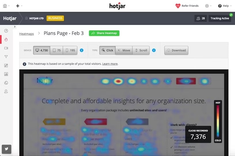
Click heat maps show where users click on a webpage. For most webpages, you’ll likely find that the majority of clicks are on the navigation bar, hyperlinks and CTA buttons. The more clicks on a certain element, the more popular it is. This helps to gauge audience intent and engagement, and can be beneficial for conversion rate optimisation, as it allows you to see how many people are clicking on a CTA, and compare this to how many people actually convert.
This type of heat map also offers a variety of insights into user experience. For example, you might find that a lot of users are clicking on an element that isn’t clickable, such as an image. As well as implying that there is some visual confusion about this element that might need to be addressed, these instances highlight opportunities to continue the user journey by adding a hyperlink to these commonly clicked elements. This also helps to reduce friction during the browsing experience.
Engagement heat maps
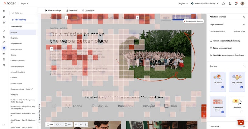
Engagement heat maps combine clicks, movement and scroll into a single colour-coded grid to show which areas receive the most attention from visitors. While it’s less nuanced than the individual heat maps on their own, it provides a simple, well-rounded overview for quick and easy insights.
By compressing all of the data into a single graphic overlay, engagement heat maps eliminate having to switch back and forth between the separate metrics. For example, you can see how many people clicked on a certain element and the percentage of them who scrolled to it in a single view. This can help to quickly and effectively relay information to key stakeholders without the need for a deeper understanding of engagement analytics.
Rage click heat maps
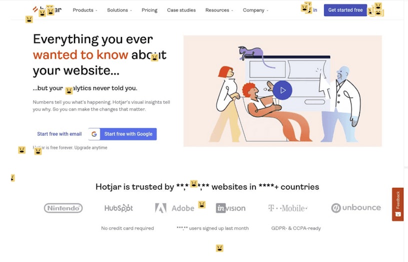
Rage click heat maps show where users click repeatedly in rapid succession. ‘Rage clicking’ is a user behaviour that happens when an element of a website isn’t working as expected and can signify technical or design issues. By analysing these heat maps, web designers can identify problematic areas and make necessary adjustments to improve user experience and site functionality.
This is more of a niche metric than those offered by some of the other heat mapping tools. However, it offers important insights into user experience that can help you create a smoother, more enjoyable browsing experience. Rage clicks could signify slow page load times, broken links, and other issues that contribute to a negative user experience. Minimising instances of rage clicks can increase average session duration, boost conversions, and encourage customer loyalty.
AI-generated attention heat maps
AI-generated attention heat maps use machine learning to predict how the human visual attention system will respond to a webpage. These include cognitive load and focus, as discussed in the above section, but can also measure:
- Clarity – how clear your website is to users. Websites with a low clarity score will appear cluttered and hard to navigate and interpret.
- Engagement – a predictor of the user’s level of immersion in the interface or image the person is likely to feel. Lower engagement pages could be found to be boring or uninspiring, whereas those with higher engagement are likely to have increased interaction and this could lead to higher purchase intent.
Predictive attention AI should be used as an indicator of visual attention but is limited to only bottom-up attention, which is driven by the stimulus as they don’t have the executive goal-seeking functionality of a human so are limited in this capacity. As such, we always recommend that you follow up AI-generated heat map studies with real-world user research.
Who uses website heat maps?
While there are many different industries that use heat maps in various forms, website heat maps tend to be implemented by UX designers, marketers, data analysts and product teams. The insights gained can help to inform website design, supporting the optimisation of user journeys. For marketers, heat maps provide essential insights into delivering effective messaging to increase conversions. By showing how users engage with certain elements, they can help product teams understand which elements of an application or piece of software are functioning well, and which ones users don’t interact with.
Business and website owners can also make use of heat maps to inform their design and user experience decisions. However, it’s worth bearing in mind that effective heat map analysis requires an in-depth understanding of a broad range of specialisms across user experience design, customer psychology and data interpretation. For that reason, businesses may choose to partner with an agency that is experienced in heat mapping and the associated analysis to ensure the best results.

Heat map examples and use cases
Heat maps can be used for a wide range of applications, offering insights into user behaviour and engagement patterns. Heat map data is particularly beneficial when used in conjunction with other tests and tools to ensure a holistic view of how users interact with the website. Let’s look at some heat map examples and how they can be used to increase key performance metrics.
Combining A/B tests with heat maps
A/B tests are used to compare the performance of a new version of a webpage against the original, which acts as a control. In A/B testing, it’s important to only change one element at a time, allowing for better attribution of the results. Combining A/B testing with heat maps provides clear insights into user behaviour before and after the change.
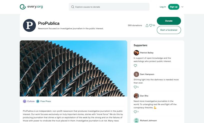
Hotjar’s Every.org case study outlines how heat mapping helped the company to identify a critical issue in their donation flow, where users were rage-clicking the donate button, without having entered their card details. By analysing the heat maps, Senior Product Designer Dave Sharp hypothesised that redesigning the donation form to separate the steps of adding a card and making a donation would reduce user frustration. A/B testing confirmed this hypothesis, resulting in a 29.5% increase in donations.
Integrating heat mapping tools with Google Analytics
Google Analytics provides detailed metrics on traffic, user demographics and conversion rates, but it doesn’t always explain why users behave in certain ways. Heat maps fill this gap by visually representing where users click, scroll and engage most on a webpage, highlighting areas of interest or frustration. By linking these two tools, businesses can correlate specific user actions with broader trends, identify patterns, and make data-driven decisions to improve user experience, optimise design, and ultimately boost conversions.
Hotjar’s Adapt Worldwide case study details how this marketing company combined heat mapping and session recordings with Google Analytics data to gain deeper insights into user behaviour on their client’s website. In particular, they were able to identify areas of frustration through rage clicks and analyse engagement patterns to understand user focus. This led to targeted design changes on the client’s website, such as implementing a sticky form and adjusting the content layout. This resulted in an 86% increase in chair sales and a 74% increase in bed sales, whilst also reducing cost per acquisition (CPA) for both.
Inspiring hypotheses for user testing
When making changes to a website, it’s important that any decisions are based on evidence rather than assumptions. While experienced marketers, designers and analysts can make informed guesses about the underlying cause of underperforming web pages, being able to back this up with solid data provides additional confidence that the reasoning is sound. Heat maps help to minimise risk and can encourage buy-in from key stakeholders.
In their case study, UX designer and researcher Ihor Stepura used heat maps to validate a hypothesis about usability issues in the FatSecret app, which tracks calories and macronutrients. Steptura hypothesised that excessive and duplicated information on certain screens increased the number of misclicks, leading to a negative effect on user experience. After redesigning the interface to simplify navigation and improve recipe interactions, they integrated heat maps with usability testing, which revealed significant increases in usability scores and user satisfaction.
Fixing errors in user journeys
While designers and marketers might have an ideal user journey in mind for a certain webpage, in reality, this isn’t always how real people interact with it. Heat maps can help to identify issues that are preventing users from following certain pathways, such as broken links, which could be signified by rage clicks on a button or hyperlink. Similarly, scroll maps may highlight that users aren’t reaching an important element on the page and are bouncing due to a lack of engagement.
Hotjar’s Every.org case study highlights the effectiveness of watching videos of individual user sessions to identify errors. Senior Product Designer Dave Sharp notes the value of watching people going through the donation flow and seeing the issues that arise, such as an element not loading or a button not functioning. Users who came across such issues didn’t get in touch with the organisation; they simply gave up completing the donation process, leading to lost funds. These session recordings provided insights that allowed the issues to be fixed to optimise customer journeys and increase donations.
How to get heat maps for your website
As heat mapping has continued to develop and become a standard practice in a variety of industries, accessibility to the tools required has also increased. There are a variety of different options available, ranging from simple yet effective free tools to more advanced platforms, providing a solution for businesses of all sizes.
Free heat mapping tools
For those on a budget, there are several free heat mapping options available, most notably Microsoft Clarity, which is a completely free tool. Many of the paid tools, including Hotjar, VWO and Mouseflow, also offer free plans that allow users to take advantage of a basic version of the platform.
While they can provide great insights, free tools tend to offer limited functionality, such as including fewer heat map types, limiting how many visits can be tracked per day or month, and not enabling heat maps to be downloaded. They may also only support one user or one website at a time, making them less versatile for larger businesses, or agencies offering heat mapping services to multiple clients.
More advanced platforms for heat mapping
As well as free options, you can find a wide range of paid platforms offering more advanced heat mapping functionality. Popular examples include Hotjar, CrazyEgg, VWO and PostHog. Like most digital tools, it’s important to take advantage of free trials and demos to determine how well the platform fits into your business before committing.
With these more premium heat map solutions, you can unlock sophisticated analytics tools, unlimited user tracking, and the ability to save and download heat maps, giving you access to historical data to inform more decisions. These advanced platforms also tend to have more processing power, meaning that heat maps load quickly, making it easier to switch between them and filter results.

Using heat map analysis to improve user experience
The crux of heat map analysis is identifying hotspots and coldspots on a page. Hotspots represent areas with high engagement or frequent clicks, suggesting that they’re effective or attention grabbing, whilst coldspots indicate sections that are overlooked or underperforming. By capitalising on hotspots and addressing coldspots, you can better align content with user interests and behaviour. To do this effectively, you need to drill down into different heat map types.
Analysing click patterns helps in understanding user behaviour, and identifying where clicks are concentrated and where misclicks occur. This can reveal issues like broken links or confusing navigation. Scroll depth allows you to evaluate how far down the page an average user will scroll. This allows you to ensure that important content is placed in an optimal location to ensure that it gets seen. Engagement heat maps can also illustrate user focus, providing insights into how you can emphasise important content.
Heat maps are valuable tools for improving user experience, but require a methodical, analytical approach to ensure the best outcomes. As well as analysing heat maps on their own, combining them with A/B testing allows you to compare design variations to ensure that you choose the most effective layout. You can also integrate heat map analysis with user feedback and usability testing for even more insights to inform design decisions.
Heat map analysis and CRO by Impression
Heat maps provide a valuable source of information that can not only back up hypotheses about website performance but can also highlight problems that would have otherwise gone undetected.
While a heat map can provide deeper insights into user behaviour, it’s important to effectively analyse the data and use it to make informed changes to address any issues uncovered. This can be complex and time-consuming, particularly for larger websites, or for smaller businesses with fewer marketing resources.
As part of Impression’s CRO services, we use heat mapping in conjunction with website experiments and behavioural science, ensuring a thorough, data-driven approach. To discover how our talented CRO team can help to optimise your website performance, get in touch with us.

