Why does the first £1,000 you spend on a marketing channel sometimes work harder than the last £10,000? The answer lies in saturation curves, and they’ll tell you exactly how effective each pound you spend really is.
What exactly is a saturation curve?
Saturation curves illustrate how the effectiveness of a marketing effort diminishes over time. They’re a great visual way to represent the principle of diminishing returns in marketing.
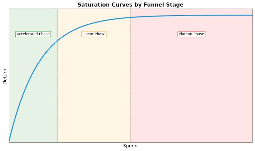
If we plot spend on the x-axis, and revenue (or other chosen KPI) on the y-axis, we’ll end up with something like this.
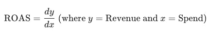
The ROAS is equal to the gradient of the line. The steeper the line, the more efficient the marketing activity is.
We can split the curve into three sections.
- Accelerated Phase: At the beginning, a small investment yields a return at a highly efficient rate. This is often when you’re first reaching a new audience on a new channel.
- Linear Phase: As you increase your investment, the returns continue to grow, but the rate of growth begins to slow down. You’re still getting good results, but any additional budget isn’t quite as impactful as before.
- Plateau Phase: Eventually, you reach a point where additional spend provides very little, if any, new return. You’ve saturated the market or audience for that specific channel. Pushing more budget into it at this point becomes inefficient and wasteful, and would be best served on a different channel.
Why marketers need to know about saturation curves
Understanding saturation curves is crucial for optimising marketing spend. Instead of blindly increasing a budget, marketers can use saturation curves to make data-driven decisions.
If your saturation curve suggests that one of your channels is in the accelerated phase, you can be confident that allocating extra budget here will guarantee you a good return.
Conversely, if you are spending £20,000 for a return of £60,000, but the curve suggests you could get £55,000 by spending just £10,000, it becomes clear that your final £10,000 is working incredibly hard for very little reward. The extra £10,000 budget would be much better served by being reallocated to a different channel that is still in its Accelerated Phase.
Ultimately, saturation curves help marketers avoid overspending and guide them toward a more diversified and efficient strategy that maximises overall ROAS.
If you know how much you are going to spend, you can then use the charts to predict the revenue that would be generated.
Alternatively, if you know the ROAS you need to achieve, you can identify the optimum spend.
Comparing Channels
While every business is unique, saturation curves generally fall into two categories based on where they sit in the marketing funnel: Bottom of the Funnel (BOF) and Top of the Funnel (TOF).
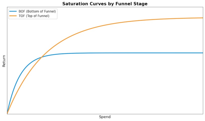
Bottom of the Funnel
Think of activities like Google brand search or Meta conversion activity. These campaigns target a small audience, but these are people who are already looking for you.
The bottom of the funnel campaigns have a very steep initial gradient in the accelerated phase, because these users are ready to buy, often delivering your highest ROAS. However, because of the small audience, these curves flatten rapidly, and you hit the plateau phase quickly. Once you’ve captured everyone searching for your brand, spending more won’t create more customers; it just makes the ones you have more expensive.
Top of the Funnel
These are awareness campaigns like video ads or social prospecting. They reach a much wider audience who may not know your brand yet.
These campaigns have a gentler slope. The accelerated phase is less steep. The ROAS might not look as impressive as BOF at low spend levels because you are introducing yourself rather than closing a sale. The saturation curve stretches much higher due to the wider audience. These curves saturate slowly. While the initial efficiency is lower, the total potential for scale is much higher.
How do we actually create saturation curves?
We have spoken about how we interpret saturation curves, but how do we actually create them?
The answer is Marketing Mix Modeling
While you might spot saturation patterns by manually tracking your channel performance over time, MMM is the statistical method that builds these curves with precision and reliability.
What Marketing Mix Modeling Does
Marketing Mix Modeling (MMM) analyses your historical marketing data, spend, revenue, impressions and conversions across all channels simultaneously. But unlike platform analytics, MMM accounts for:
- External factors: Seasonality, competitor activity, economic shifts, promotions
- True incrementality: What revenue each channel actually drives, not just what it claims credit for through last click attribution
What Marketing Mix Modeling outputs
MMM quantifies the exact relationship between spend and return for each channel, showing you precisely where the accelerated phase ends and the plateau begins.
Instead of guessing where your channels saturate, you get statistically calculated curves that reveal where each channel has room to scale or where you’re overspending.
Saturation curves provide a clear roadmap for budget optimisation by showing exactly where your marketing spend stops driving growth and starts hitting a plateau. By identifying which channels are still in their high-efficiency Accelerated Phase, you can move away from guesswork and ensure every pound is invested in its highest-yielding tactic.
TL;DR: The bottom line
Not every pound you spend on marketing works equally hard. Saturation curves reveal the “Goldilocks Zone” of your marketing budget:
- The Accelerated Phase: Low spend, high efficiency. You’re reaching the low-hanging fruit.
- The Linear Phase: Growth is steady, but the “easy” wins are gone. Efficiency starts to dip.
- The Plateau Phase: You’ve hit the ceiling. Adding more budget at this stage doesn’t buy more customers, it just makes your existing ones more expensive.
To maximise your total ROAS, stop over-investing in “Bottom of the Funnel” channels once they plateau. Instead, use Marketing Mix Modeling (MMM) to find the next channel still in its high-efficiency “Accelerated” phase.