
In March 2025, Google released Modern Charts for Looker Studio to the general public, following a preview in February. This feature has received continuous updates, introducing significant changes that give marketers greater control over how data is curated and presented.
What’s new? Key design changes for Marketers
The modern design updates in Looker Studio bring a wealth of improvements across two primary areas: Chart Styling and Responsive Reports.
Charts and Styling
This update introduced various new chart styles and enhanced formatting options, providing new ways to design and display data.
In a nutshell, the main improvements include the following:
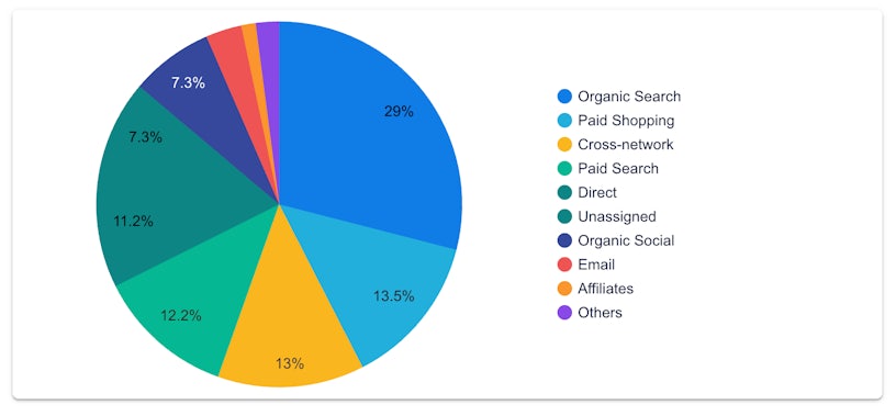
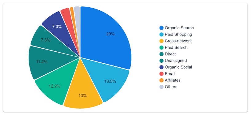
- New default colour themes
- New axis label rotation settings
- New chart padding control settings for pie charts and doughnut charts
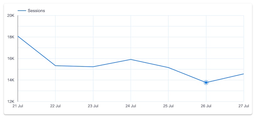
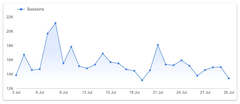
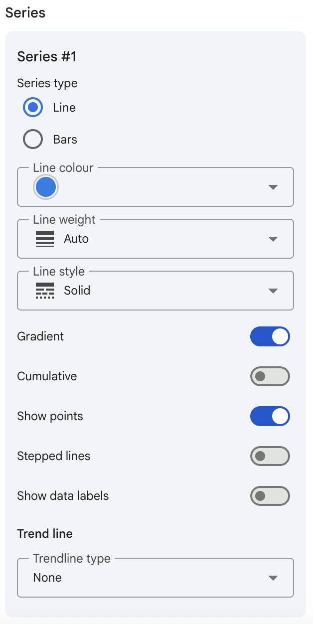
- New line gradient settings for line charts and time series charts. You can also change the grid colour for each chart instead of having one setting for the whole report.
- New transparency options for bubbles on scatter charts and bubble charts
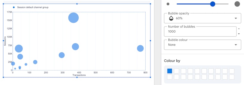
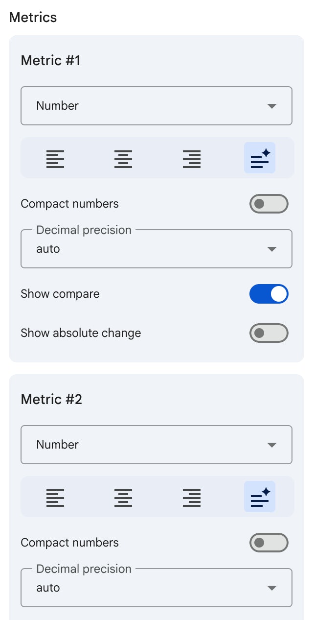
- You are given greater control over colours, fonts, and styling. You can customise the formats of each element of the charts, such as each line, each metric in the table
How to change to the modern chart setting
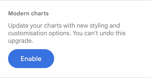
It’s important to note that these modern chart features are now generally available and are the default for all new Looker Studio reports. For your existing reports, a simple upgrade is required to use these new capabilities. Once you “enable” your dashboard to display modern charts, this action can’t be undone.
Go to edit mode > theme and layout > Enable Modern charts
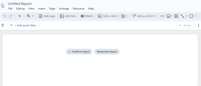
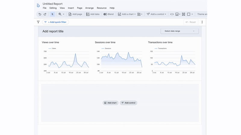
Responsive Dashboard
Beyond visual enhancements, Looker Studio has also introduced a responsive layout. This dynamically changes how the dashboard looks, which is useful for reports designed to be viewed on a mobile device.
Its main features include:
- It automatically resizes and rearranges charts and components to fit the viewer’s screen, eliminating the need for manual resizing or excessive zooming on mobile devices.
- 12-Column Grid System: Responsive reports are built on a 12-column grid. This system ensures that components are organised neatly and scale proportionally as the screen size changes.
- Sections: Components are grouped into “sections,” which are the core building blocks of a responsive report. Sections stack vertically, and their height automatically adjusts based on the content within them. This organised structure makes the report clean and easy to scan.
- Section-Specific Filters: You can apply filters that only affect the components within a specific section, allowing for isolated analysis within different parts of your report.
Limitations:
- No Overlapping Components: Unlike the freeform layout, you cannot overlap or layer components on top of each other. Each chart or element must occupy its own space within a section.
- No Fixed Canvas Size: The canvas size is not fixed; it is automatically determined by the height of the sections and adjusts to the viewer’s device width.
- No Grouping: Components are managed by sections rather than by a grouping feature.
- No Report-Level Elements: You cannot have elements like headers or logos that appear on every page of the report automatically. Each page must have its own components.
These updates may seem minor, but they significantly improve the reliability of reports in Looker Studio. The updated charts are more visually appealing and ideal for presentations, allowing for greater customisation and clarity.
Responsive reports are simple to set up and have a great number of use cases. All in all, a really useful addition for any Marketer.