
Vertical reference lines and bands in Looker Studio are useful tools for marking down key moments and periods that could influence performance, opening up the opportunity to analyse the impact of marketing activities and wider contextual factors more clearly in a single view. Whether you’re looking to highlight the date when a new product was launched – or emphasise the phase when a Google algorithm update took place – Looker Studio offers the functionality to enrich your graphs with this information using vertical reference lines and bands.
Looker Studio’s horizontal reference lines and bands allow you to highlight preset values that you can compare with actual data. Say you wanted to check whether budget allocations towards your marketing channels fall within acceptable limits. You can use horizontal bands to emphasise this range on a chart, and show clearly where current expenditure sits within it. Horizontal reference lines, on the other hand, enable you to set static targets for any given metric, which could come in handy if you’re looking to add monthly sales quotas to a graph.
Written based on the experiences of our analytics agency team, this guide walks you through the use cases and setup process for each of these reference line/band features in Looker Studio. If you’re looking to explore more advanced applications or simply evolve your marketing effectiveness measurement, reach out to our team today for a free consultation.
Reference lines
Unlike usual horizontal reference lines, you can only use vertical reference lines in ‘Time Series’ charts with the ‘Date’ value. These are helpful for highlighting any important dates for your marketing activities. There are several types of marketing reports that we can utilise these features. For example:
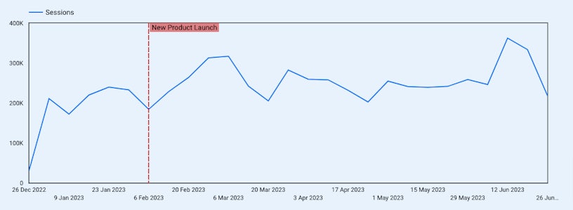
- New product launch: You are launching a new product line and would like to track the increase in total weekly sessions going to your website after the date.
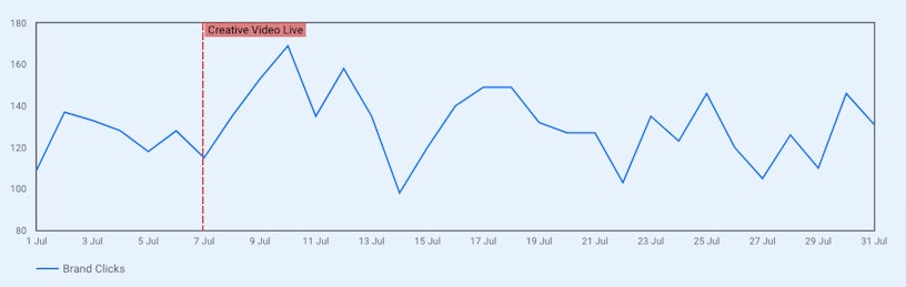
- Creative campaigns live: Your creative campaign just goes live, and want to see the increase of clicks from brand queries on Google searched by ‘Date’.
Reference bands
Vertical reference bands
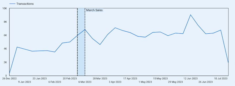
Similar to the vertical reference line, this feature can only be applied for ‘Time Series’ charts with a ‘Date’ dimension. They are useful in highlighting a period of time, such as a promotion or sale.
Horizontal reference bands
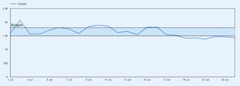
With the Y-axis, we can now create reference bands to highlight a range of values. This feature can be applied to several chart types, including ‘Time Series’, ‘Bar’, and ‘Area’. You can use this to highlight a particular range, such as the PPC daily target spend range.
How to set up reference lines and bands in Looker Studio
After identifying which reference line or band you would like to create, the next step is setting them up in Looker Studio.
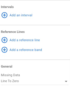
First, select your chart. Then, navigate to the ‘Style tab’, then choose ‘Add a reference line’ or ‘Add a reference band’.
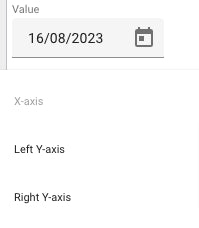
For ‘Date’ reference lines and bands, choose the X-axis and then fill in your reference date. You can change the colour of chosen lines and ranges. For ‘Value’ reference lines and bands, choose the left or right Y-axis and select the type of reference (constant value, metric or parameter).
Limitations of reference lines and bands
- You can’t add a reference line to 100% stacked charts.
- Stacked columns, stacked bars, and stacked area charts only support constant value and parameter reference lines.
Want more actionable tips and insights on all things digital marketing and measurement? Be sure to check out more of our online measurement blog. If you have any questions about what was covered above or just want to up your company’s analytics game, get in touch!

