Research shows that “The human brain processes images around 60,000 times faster than text”; If you’re navigating the maze of a hundred data points and trying to understand the key insights, infographics help to transform complex information into an easily digestible and actionable format.
In marketing, data visualisation plays a crucial role by enabling marketers and business stakeholders to understand what data is telling them quickly.
What is data visualisation?
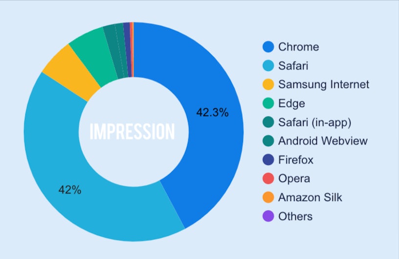
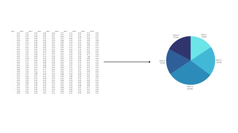
Data Visualisation is the process of transforming raw data and information into meaningful, visually compelling formats. For example, pie charts allow users to visually highlight the proportions between categories, unlike raw data, which can often obscure these relationships.
Visualisation and its benefits
Simplify complex data
Need to see your product’s sales trend over the last 12 months? A simple line graph, created in a spreadsheet or visualisation tool like PowerBI or Looker Studio, can provide the answer. Visualisation doesn’t always require complex setups; it can be done conveniently, providing quick answers to specific questions.
However, for regular data checks and those “aha!” moments of marketing clarity, advanced dashboards are transformative. They go beyond surface-level visualisations, seamlessly integrating diverse data sources to uncover hidden connections and actionable insights. These visualisations illuminate the path to data-driven success and allow marketers and business leaders to focus on what truly matters, cutting through the noise of endless metrics.
By presenting visually compelling data that tells a coherent story, teams can quickly grasp complex insights, identify patterns, and make connections that might be missed with raw data alone. Data storytelling empowers marketers to communicate findings in an engaging manner that supports their claims and highlights successes and actionable opportunities. In the absence of visualisation, understanding and correlating multiple data points becomes a challenge, leading to missed insights and less effective decisions.
Bridging the gap between data and insights
Now that we know the benefits of visualisations, where do we start? The first step is to understand what you’re looking for, whether you’d like to see sales trends over time or know which channels contribute the most to your revenue. This understanding allows you to choose the proper visualisation to present the insights correctly. Each type of chart has its own purpose/goals to show the meaning of the data. Let’s dive into some examples:
Pie charts
Pie charts offer an advantage in simplicity and immediate visual impact, particularly when the goal is to emphasise the proportion between different categories within a dataset. However, pie charts can become less apparent when there are too many segments or when precise numerical comparisons are required, making other chart types more suitable for such situations.

Line graphs
On the other hand, line graphs are useful to identify patterns, seasonal fluctuations, or the impact of specific campaigns. For example, from a set of data of sessions in 2024, we make a line graph to show monthly data. We clearly see the peak period is from April to August. From that insight, we would want to spend more during this period than others.
With a clear and well-presented visualisation, all stakeholders can grab this information in a second, which shows the power of data visualisation in day-to-day activities.

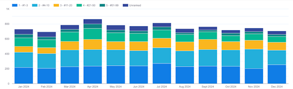
Bar charts
Bar charts, especially stacked bar charts, can effectively illustrate the relationships between categories, as they provide a clear and visually engaging way to compare data within and across groups. Standard bar charts allow for straightforward comparisons of individual category values, making them ideal for showing differences or trends. Stacked bar charts take this a step further by breaking down each bar into segments that represent subcategories, enabling viewers to see both the overall totals and the contributions of each component.
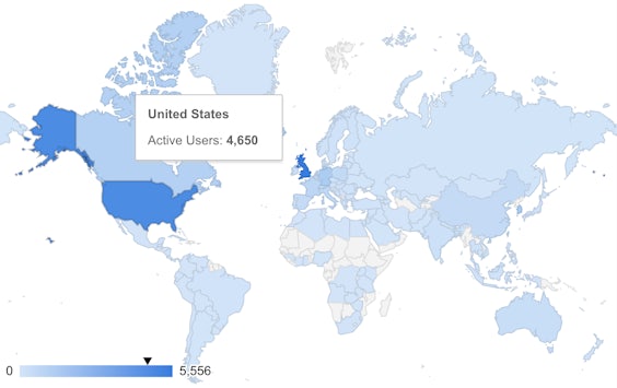
Heat maps
As for filled maps/heat maps, they are ideal for comparing the performance among various regions. They are helpful specifically for organisations operating in multiple regions. With some interactive visualisations. You can both see the intensity and actual figures at the same time.
Data visualisation tools
You don’t need anything fancy to start with; a simple Google sheet or Excel spreadsheet can help you simplify your dataset. Tools like these provide foundational capabilities, such as generating basic charts and graphs, which can effectively communicate simple insights. Yet, there are several more powerful tools that can support building advanced visualisations such as:
Looker Studio
(Formerly Google Data Studio) A free, web-based data visualisation tool that helps users create interactive dashboards and reports. Google offers a pro version, but users can use most of their robust features with the free version. Among various options, Looker Studio is often a good choice for marketing reports. It’s ideal for marketers who rely on Google Analytics and other Google products since it integrates well with most Google-based services. It also integrates seamlessly with BigQuery, Google’s powerful cloud-based data warehouse, allowing users to process large and complex datasets. Additionally, the tool has a drag-and-drop interface that is intuitive and straightforward to start with.
Power BI
A data visualisation and business intelligence tool developed by Microsoft. Similar to Looker Studio, it enables users to connect to diverse data sources, transform datasets, and create interactive dashboards and reports. It integrates with other Microsoft products such as Excel and Azure, making it an excellent choice for marketers using those products in their marketing activities. However, Power BI’s desktop version only runs on Windows and is not compatible with Apple products.
Tableau
A comprehensive data visualisation tool designed to handle large datasets and create visually stunning, interactive dashboards. While a free version, Tableau Public, exists, it offers limited data source connections. To unlock Tableau’s full potential, a subscription is required, which can be more expensive than other tools. Additionally, Tableau has a steeper learning curve than some other data visualisation tools.