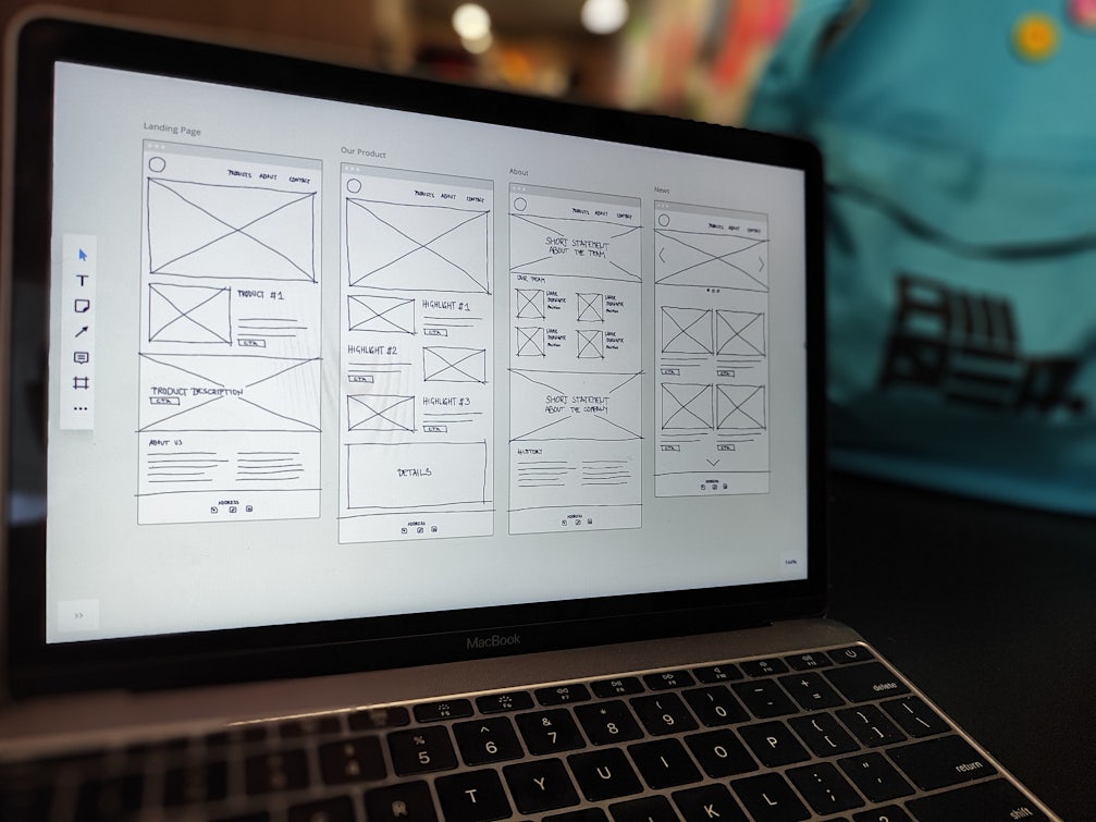
In the ever-changing realm of digital marketing, optimising your landing pages can feel like an intimidating task.
In this blog, we’ll cover the different types of landing pages, how you can optimise them using behavioural science tools and look at some examples of different landing pages.
If you’d like more info on how our digital experience services could help you optimise your website & landing pages, feel free to get in touch.
- Defining a landing page
- Different types of landing pages based on search intent
- Informational
- Navigational
- Commercial
- Transactional
- The psychology involved in landing pages
- Attention
- Memory
- Anxiety
- Loss aversion & scarcity
- Reciprocity
- Trust
- Motivation
- Landing page building blocks
- Headlines & title copy - The Hero area
- Call-to-action
- Visual cues
- Copy
- Video
- Imagery
- Design and layout
- Research & experimentation
- Examples of effective landing pages
- Informational - Headspace | Meditation for work
- Informational? - IKEA | How to create three workspaces in one room
- Navigational - ASOS returns form page
- Commercial - Masterclass
- Commercial - Google Pixel Comparison page
- Transactional - Lick | Paint Product Page
Defining a landing page
To start off, let’s take a look at what we mean by a landing page. A landing page, also known as a sales page or squeeze page is a page on which a user lands after clicking on an ad from sources like paid social, PPC, email CTAs or any other form of link that leads them to a specific page on your website.
Landing pages should:
- Serve a single purpose
- Have a clear goal
- Be created with a specific audience in mind.
That purpose could be to generate leads, deliver sales or provide information. Creating multiple landing pages that address different demographics with different needs will allow you to tailor your content to their specific requirements, as well as provide a unique focus for different marketing campaigns.
Different types of landing pages based on search intent
Informational
Informational landing pages usually come in the form of blogs or guides and are relevant when a user wants to know more about something. This type of page most often supports the awareness stage of the conversion funnel, albeit certain formats such as buying guides can lean more towards the interest and desire phases.
Navigational
Navigational landing pages are intended for a specific purpose. The user already knows what they’re after when searching (e.g. Facebook login or ASOS returns). The page could be in the form of a homepage, login page or contact page and should be available easily for users.
Commercial
A commercial landing page is most relevant when the user is closer to purchasing and should contain information on pricing and an option to buy, whether that is different pricing options for a service or a product page.
Commercial pages are a little harder to pin down as they are somewhere between informational and transactional, the user might need more information and want to compare pricing or product options.
Transactional
A transactional page should support the conversion journey. This could be purchasing a product, filling in a form or signing up for a free trial. On a transactional page, we should aim to reduce distraction and anxiety and increase clarity and value to motivate the user to convert.
The psychology involved in landing pages
An interesting challenge that marketers face is how to effectively influence user behaviour. Using psychology to influence the actions of users is becoming more critical in today’s noisy digital landscape filled with adverts and marketing campaigns fighting for user attention.
Being aware of how the page performs from a behavioural science standpoint means we can optimise more effectively.
Attention
A landing page should serve a single purpose, and aim to keep distractions and noise to a minimum to keep the user’s attention.
Memory
The human brain can only retain up to 7 (+-2) pieces of information at once. An overload of information for a user to retain can result in choice paralysis, overwhelm and avoidance of making a decision which will impact the performance of your page.
Anxiety
People like to feel in control, especially when purchasing. Consider if anything could be causing uncertainty or anxiety on your landing page. For example, ensuring your CTA message tells the user what will happen when they click reduces uncertainty.
Loss aversion & scarcity
Also known as FOMO (fear of missing out). As humans, we value not losing something or missing out and will do anything in our power to avoid it. Using messaging to drive urgency or a sense of scarcity (e.g. Only X number of items left in stock) can trigger this FOMO response.
Reciprocity
The principle of giving in exchange for receiving. This is particularly powerful when it comes to sharing personal information. Unless users feel like they are getting something in return (e.g. a freebie) they will be more reluctant to part with their details.
Trust
For users to engage with your product or service, trust is crucial. You must provide genuine evidence to build that trust. Reviews, user-generated content, awards and testimonials are good ways to show your legitimacy.
Motivation
Essentially we want to push the user through the journey by motivating them to do so, this could be through a loud urgency message or something as subtle as a green tick when a user types their details into a form.
Landing page building blocks
Headlines & title copy – The Hero area
The headline should be powerful and give the reader the most relevant context for the page (e.g. the title for a commercial landing page is likely to be different to informational). It should be short, memorable, and motivate the user to stay.
A subheadline to complement the headline – If the headline grabs the user’s attention, then the subheadline should make them stay. It should take the opportunity to go into more detail about the offer at hand.
A small paragraph to further promote the offer – This is a great opportunity to elaborate on what’s on offer in a nutshell. Bullet points or statistical data are a bonus.
Supporting image or video – Visual content is an essential component of landing pages. The brain processes images 60,000 times faster than text, so users will be affected by the images on your landing page instantly. Focus on high-quality, relevant visuals that complement what you are selling.
Supporting proof elements – Sometimes you need evidence to support your case, testimonials, customer logos, or security badges can help build trust and encourage users to convert.
The importance of a good page title cannot be overstated. This is usually the first thing visitors will notice and is their first indicator as to whether your page serves their needs or not. Not only that but if your page is indexed, then your title will be one of the factors used to determine how well you rank in Google, as well as affecting how likely users are to click on your site
Call-to-action
Usually, a button to click or a form to fill in is the most obvious element as it captures the conversion. It must be simple, clear and free of distractions. Limit the information that you need from the user to make leaving a few details simple.
Visual cues
Visual cues tell the user where to look. This could be in the form of arrows, colours, movement or icons. Universally recognised cues can also influence behaviour, for example, showing your Trust Pilot rating using the TrustPilot logo & stars sends a trust signal to the user.
Copy
Throughout the page content, you should write in a tone that meets your brand voice, aiming to inform your potential customers without patronising them. Make sure to promote your USPs clearly, and include a consistent and engaging call-to-action scattered throughout the page.
Breaking your content down into clear sections, or even simplifying it into bullet points will make your page much easier for users to digest, and reduce the risk of them bouncing off the page. It’s also important to ensure that your copy gets to the point you want to make fairly quickly, and doesn’t conflate this with other topics that ought to be served by separate pages.
If you do want to mention additional things which don’t strictly fit the purpose of your specific page, link to a more relevant aspect of your site and gain the benefits of internal linking. This will also improve the user experience of your page and increase the likelihood of them staying on your site rather than going elsewhere.
Methods of contact – Having a phone number or address can help clarify that your company is genuine. If a user is hesitant about converting, having a point of contact can ensure that users can choose to get in touch. Don’t overdo it though, links to social media accounts could distract the user away from converting!
Video
If you have video assets at your disposal, these can be highly engaging and informative resources to include on your landing page. Giving potential customers an opportunity to see your product or service in action is the easiest way to demonstrate what you offer and for them to decide whether it suits their needs. In some cases, this has been shown to increase conversion by as much as 86%.
Alternatively, depending on what you are promoting, it may be appropriate to use video as a lead generation tool. For example, someone selling e-learning content could offer free access to an introductory video for users who submit an email address. Collecting this data in a GDPR-compliant way means it can then be passed onto your sales team, who can reach out to these lukewarm prospects and convert them into paying customers.
Important note: think carefully before making any videos auto-play sound. While this may be intriguing to some users, it can also be incredibly annoying for others.
Imagery
Imagery is key to any landing page, regardless of the product or service on offer. It serves many purposes, including visualising the product on offer as well as breaking up chunks of copy. (As a general rule, avoid including walls of text on your landing pages anyway. But images provide a nice break for the eyes).
Make sure to invest in some high-quality photos of what you’re selling, otherwise, your imagery could end up working against you. Be sure to include photos which convey quality, legitimacy, and value for money.
Design and layout
Studies show that when a user lands on your website, their eye path starts from the upper left corner, and moves on from there. According to layout studies, these areas on a page get the most attention:
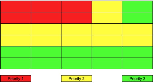
Taking this into account it would make sense to assume that positioning your headline and subheadline in the top left section of your page in a clear, readable font should get you off to a good start. Of course, there can be expectations, but use this as a starting point and test from there.
Another study that further supports predictive eye movement is the Gutenberg Diagram, also known as the ‘Z pattern’.
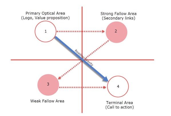
The Gutenberg diagram divides a page design into four areas: the primary optical area at the top left, the terminal area at the bottom right, the strong fallow area at the top right, and the weak fallow area at the bottom left.
According to the diagram, Western readers naturally begin at the primary optical area and move across and down the display medium in a series of sweeps to the terminal area. For example, a layout following the Gutenberg diagram would place key elements at the top left (headline), middle ( form or image), and bottom right (call to action). Again, it’s important to consider this as only a guide for predictive eye movement and not a guarantee, as we can dictate where users look using visual hierarchy.
Research & experimentation
Everything covered so far should give you a lot to think about, but in order to de-risk any potential changes to landing pages, a level of research and experimentation should be considered.
An effective landing page should have a mix of quantitative (the what) and qualitative (the why) research behind it, followed by a level of either experimentation or user testing to gain certainty that the changes are the right ones to make.
Without this approach, you won’t know with any certainty if the changes you intend to make will drive higher conversion rates, or if they will cause a drop in conversion rate, meaning more time, money and resources have to be spent making more changes.
Examples of effective landing pages
Each example is broken down by search intent. Let’s explore some landing pages, and what they’re doing.
Informational – Headspace | Meditation for work
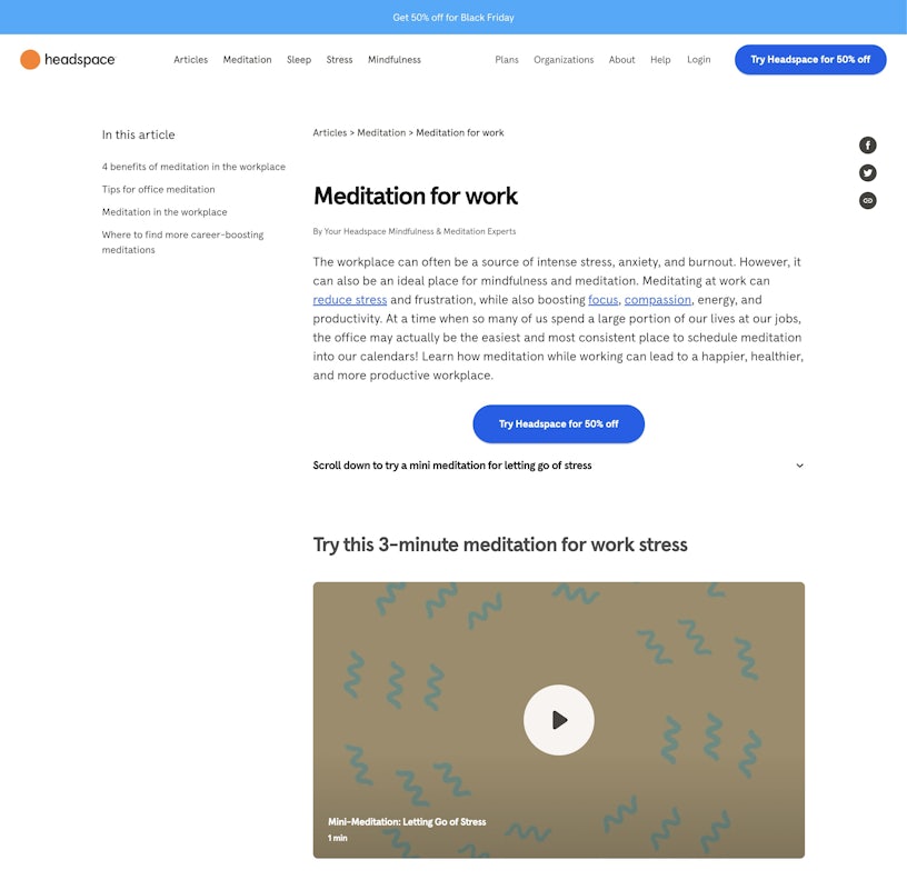
What tools does this page use well?
- Reciprocity – they offer users a ‘free’ 3-minute meditation and the option to start a free trial directly below.
- Imagery & video are used on the page to break up the blocks of text.
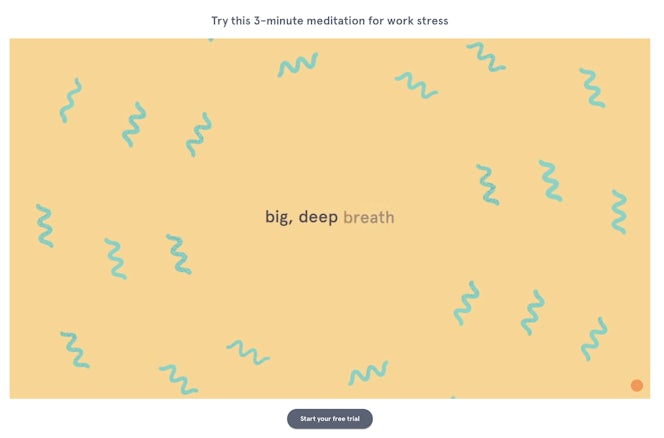
What could be improved?
- The larger areas of text on the page could be optimised with the use of spacing, icons or bullet points.
Informational – IKEA | How to create three workspaces in one room
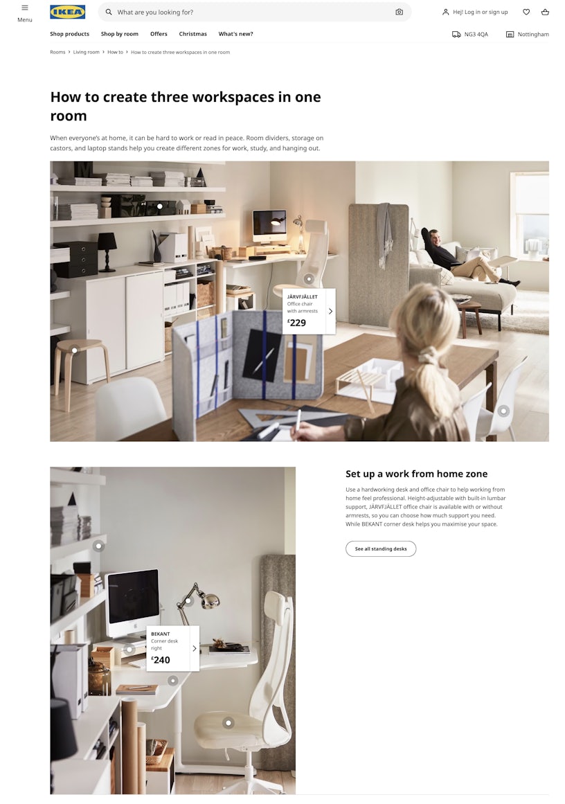
What tools does this page use well?
- Ease – IKEA makes it easy to digest information by tagging the images with the products featured & showing prices.
- Memory – Very small amounts of text used against each image meaning the user doesn’t need to digest and remember lots of information.
Navigational – ASOS returns form page
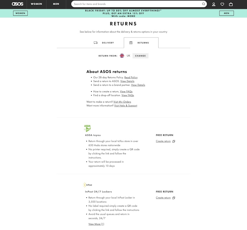
What tools does this page use well?
Relevancy – for a user with the intent of returning an item, this page serves that purpose well, it provides information and clarity on the returns policy, and gives the user a clear action to take.
Ease – by having a consistent layout across the different options, it’s easier for the user to select the right one.
Motivation – use of ‘FREE’ against each option.
What could be improved?
- The ‘create return’ CTAs could be clearer, particularly on smaller screen sizes.
- The use of imagery could be improved by enlarging the logos of each returns service as this is more likely to help the user make a decision.
Commercial – Masterclass
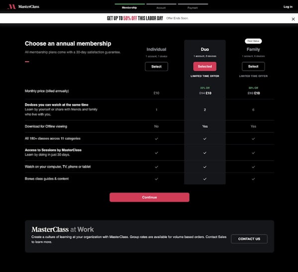
What tools does this page use well?
- Clear differences between each pricing option
- Call out of limited-time offer with discount values shown & best value called out.
- Simple, clear design with little distraction on the page to push the user to the next step.
What could be improved?
- Clarity – inconsistency with the use of ‘yes’ and tick icons could be improved.
- Memory – using icons could help users retain the benefits of the product.
Commercial – Google Pixel Comparison page
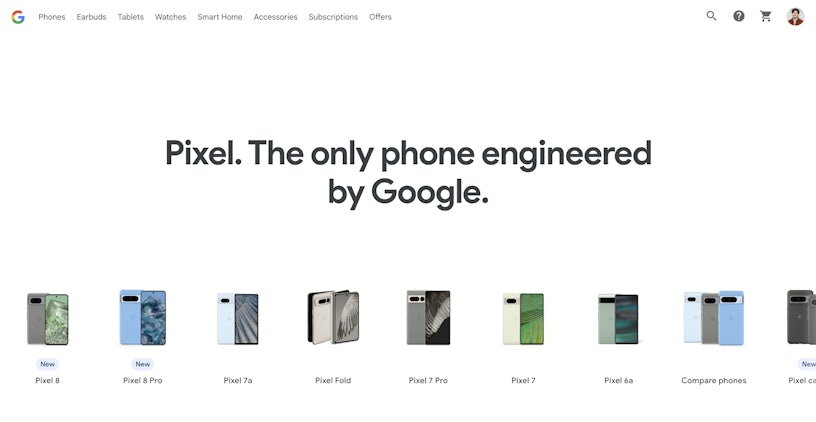
What tools does this page use well?
Ease & memory – icons are used to compare different features of the phones next to each other.
Attention – the user is able to explore phones in more detail before comparing different models further down the page, giving them all the information they need to make a decision on one page.
What could be improved?
Motivation – price isn’t shown which is a vital factor when purchasing. If the price can’t be stated, a scale (E.g. £ ££ £££) gives a sense of price comparison.
Transactional – Lick | Paint Product Page
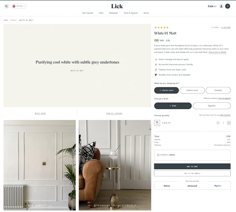
Why does it work?
Attention & ease
The use of headlines, short product copy, icons and clear CTAs pairs well with the powerful use of imagery, showing the colour in different lighting and settings, giving the user a strong sense of what to expect, which in turn, gives them a better sense of control.
Trust
User-generated content (UGC) is utilised within the product imagery itself, which acts as a trust signal, and users are 2.4x more likely to trust UGC than branded content according to Hootsuite.
Additionally, customer reviews all contain images, further signalling to the user that the product is high quality and genuine.
Motivation
Lick offers a £2 sample of the product, which gives the user a way to try the product without spending much, but makes them more likely to purchase later on.
Looking for help with your landing page?
We have a whole range of services that could help you improve the performance of your landing pages; get in touch with us here
