Why is CTA text so important?
A blog about Call to Action (CTA) text? Such a small thing? These pieces of text may be small but they are powerful — and worth optimising for your customers. The key reason for this is the CTA is always the critical decision point for your users. Each click to the next stage of a buying journey is a decision making process, so users will have questions in their minds such as:
- Do I keep going?
- Why should I click again?
- Is it safe to hand over my details?
- Is this the right decision?
If your customers have any level of anxiety pre-click, it’s our job as Conversion Rate Optimisation Consultants to remove it and remove any friction that’s in the way. Optimising call to action text is one way to help do this.
In this blog we will cover what constitutes good CTA text and what might dissuade users from completing your website form or getting to your checkout.
Poor CTA copy
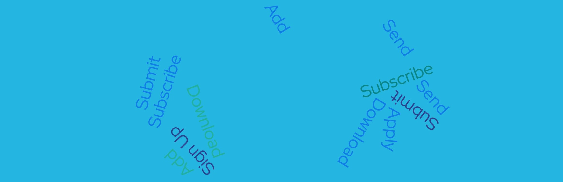
Let’s start with what not to put. As a CRO, I’m familiar with the placeholder text in the CTAs when working on new websites or websites that are being rebuilt – I’ve seen it where on some occasions this has made it all the way through production and the live site. We have all seen them:
- “Submit”
- “Send”
- “Download”
Boring, bland and not compelling for a user. Developers will place this type of text in CTAs as it is functionally correct. I asked Impressions PHP Developer James Hall why this happens:
“Html buttons that will process the action of a form instead of just having the appearance of a button have the attribute type=”submit”, the text on these buttons then defaults to submit”
If we consider a new user’s perspective, new to a brand, new to the website and the experience, trust levels will be low and user anxiety will be high. Our aim as CROs is to reduce user friction and build the trust so the user flows seamlessly through the website journey. A term like “submit” is quite negative and abrupt, it does not come across helpful and does not explain what happens next for a user. So why should they click it and hand over their details?
If we look at the definition of the word “submit” it means to: “yield to a superior force or to the authority or will of another person”.
How would you like to yield your personal information to a superior force or person? Nope, me neither.
“Send” can also create negative thoughts because it is vague. Send it where? To whom? Are you going to share it by sending it to more places etc etc.
So let’s ditch the dull dev speak and speak to our users in a helpful and clear way.
Good CTA copy
So we know the bad and what to avoid, what about good CTA text? Good CTA text tells the user what’s happening upon clicking the CTA. An expectation should be set and be confirmed on the next page or message after clicking. A really good optimised CTA text will include a product name and a power word or two. Now, I could go off at a tangent here into power words and the persuasive effects they have on humans, but that’s for another blog and another coffee break. Here is the list though:
- Your
- Yours
- My
- Free
- Now
- Instantly
Blog CTA text
Blog CTAs may be a little different from CTAs on your main website. This is because users on the blog section of your site will be in a different mind set, they will be researching and information gathering rather than having a high intent to buy. They can be quite high up the user buying journey and it could be their first visit to your site meaning they must be guided and treated accordingly.
Using text like “buy now” or “add to basket” at this point in a user’s buying journey can seem like too much too soon for them to click on. You want them in buying mode, right? Here is how, use a CTA text that links their research knowledge (the blog post) to a product or service you sell. The objective is to transition them from thinking in research mode to thinking this product solves my issue or helps improve my life. For example:
“See how [Product Name] can help you solve [Problem 1] >”
This CTA will take the user to a helpful product page with more information and an option to buy. All you need to do is make sure the product page is up to scratch and you have a good e-commerce CTA for them to add to their basket.
E-commerce CTA text
Ecommerce calls to action are the ones we are more familiar with. So we already know some of the best action phrases using urgency to place in our ecommerce CTAs, the go to ones being:
- Shop Now
- Add to Basket/Cart
- Subscribe now/here
- Place Your Order/Complete Checkout
- Checkout now/here
So how do we up our game even further? One option to test is on your home and product pages adding the product category into the CTA text. For example, if a user is shopping for clothing on an apparel store, try:
- Add to basket vs Add shoes to basket
- Shop now vs Shop dresses now
This makes it more relevant for the user rather than a standard generic CTA we have all seen before.
Add your value proposition into the CTA
If you have an offer running try adding it into or alongside the CTA. Instead of “Shop Now” use “Shop your 20% off”. This is more enticing and communicates precisely to your user what they will receive for shopping with you.
Lead Gen CTA text
Lead generation sites can have a bit more fun and creativity than ecommerce sites, we can usually find longer and more descriptive CTAs. This is due to users having to hand over their data for nothing in return at that point. So it’s a tougher sell and can require a bit more convincing.
Unbounce, the landing page builder app company, are pass masters at this, let’s have a look at their trial CTA:

It uses first person, contains an action (Start), a power word (Free) and contains the offer. All good things to have.
Here is another tactic from e-payment provider Adyen:

It also has an action but the rest relies on a more emotive approach of starting a journey with a prospective customer.
Takeaways
Because every website and business is unique, the best CTAs will only be discovered for your business, website and users by testing different versions. Here is a few good rules to help you get started though:
- Make them action-oriented
- Use the first-person where possible
- Create urgency
- Link to your product
- Visually make them stand out from their surroundings

